Thursday, 17 December 2009
Ancillary Tasks
Task #1
Album Digipack
For our digipack we have to design all the album artwork for our Album. We used Adobe Photoshop on the MacBook we used. None of us had previously used Photoshop so we found it really hard at first getting used to the software, but after a while of some trial and error we finally got used to the different tools that are available. This was our first draft.
We decided to go for the star, as this has a direct link with the lyrics "I'm that star up in the sky" in our main video, which is the main song on the Album itself. We had a picture of the same boxing gloves that we used throughout the video and we also used some effects on Photoshop to create what we thought was a "cartoon" effect. We thought this would go well as R Kelly appeals mostly to young males. If he was trying to attract an older, more serious audience we wouldn't have used it. We have also used boxing gloves, as most this is quite masculine and would appear to more males. It also shows that the artist is quite masculine and this fits in well with R Kelly's profile.
We had some positive and negative feedback from people when we showed them the Album front cover. Some people thought that the Font worked well, as it stood out, you could clearly see R Kelly. It is at the top of the cover and this is getting the message across about the album. They thought it was good that we included the star and the boxing gloves. But everyone we asked wondered why we didn't have a picture of our main character Toby on the front cover. We went back and re-designed the front cover and this is what we came up with.
We were happy with the final cover, as we got to include everything we wanted. When going back and asking the people about what they thought of the changes. They thought that the inclusion of Toby as the main picture was a good change. They also thought that keeping the cartoon effect on Toby's picture worked well.
This was the main cover, but we still had to complete the other 3 sides of the cover to complete.
Here is the first inside cover..
Here you can see we have decided to use another picture of Toby. Here you can see him recording the track. It is also a screenshot from the music video. We this would be good to use as it promotes the artist performing his track. It shows Toby singing and performing an action of pointing to the sky. We have also used the cartoon effect as we are trying to create a consistency throughout the album artwork.
The other inside cover.. (This is to go behind the CD)
This is the artwork that goes behind the CD. We have looked at a number of album's and the artwork that they have, and more often than not, the cover on the inside behind the CD is blank, or it is very plain. We have decided to put an image of Toby with his boxing gloves and hoody for training on. Although we have used the cartoon effect in this picture to keep continuity between the other images in the artwork. We thought this would be a good image to use, as this is the final shot in music video, where we zoom into a still image of Toby.
The back cover..
This is the back cover of the album artwork. Once again we used an image from the video. It shows one of the locations that we shot in. We used the cartoon effect once again to keep the consistency amongst the overall artwork. We have also used a similar colour for the font when we list the songs on the current album. We had a look at some back covers in the R&B music genre. They are all fairly simple and just show a list of the song titles. We have used this approach and have just slightly moved them as we have gone down. It's quite simple, but we think it works well.
Task #2
For our second task we were asked to create a poster that advertised the artist and the music video we had just created. We used Adobe Photoshop once again to create the poster as we thought it would be good as we all had some experience and quite a lot of success when we used the software to create our first ancillary task, the album artwork. Although we didn't have as quick success as before, we had tried many different designs, different images in different positions. The main problem we had was that we were trying to inflict more than one message on the poster. In our initial copy we were trying to promote an upcoming tour aswell as the artist and the album. This meant that none of them really stood out. After talking to a few people to see what they thought about our poster we decided to go for a simple effect. We had the picture of Toby on the page. Then we also included the front cover of the album. We decided to mention the tour, but as it wasn't the main feature of the poster.
Here you can see we have kept the cartoon effect throughout both ancillary tasks. We have also used bold yellow font to stand out. The album is also on the poster as the creates a link with it and promotes the album so people know what to look out for and can relate to the album cover when it becomes available to buy.
Thursday, 10 December 2009
R&B Album Covers
Here, I am going to go through the album covers and talk about the similarities and differences in each one.
Tha Carter III - This Album cover has one main picture on it. It is a baby that has some characteristics of the artist that it is trying to portray. Lil Wayne has these tattoos on his face and the use of a baby in the picture could be used to make Lil Wayne seem youthful or maybe even try and give him some sense of innocence. He bases his style of rapping and his artist image on being unique and this certainly fits the description of a unique album cover. You can clearly see his name and the album name next to the picture.
Here I Stand - This album cover shows Usher seemingly walking away from a car. He is standing up, which is relevant to the name of the album. The album cover once again is there to advertise his image. He is walking away from the car, and the text showing his name and the album name is clear for everyone to see. Another thing I noticed was that the text is similar although the "Usher, Here I" is Red, and the "Stand" part of the lettering is black. I don't know if there is a reason for this, as when artists change the text, it is normally to make their own name stand out.
Double Up - This is an album by R Kelly. He also performs our song choice for our video. He has quite a mixed style. He has appeared as a gospel like singer, a rapper, but perhaps has had his best success as an R&B/Hip Hop artist. This album cover is from his R&B days where he completed a double up album with other artists featuring in most of the songs. The album cover typically focuses on him and shows him as a successful performer who appears to be wealthy. This happens in many album covers as rappers and R&B artists have the image of having lots of money. The text is also in the same colour as jewellery that he is also wearing.
Paper Trail - This is probably the simplest album cover I have looked at so far. It simply has T.I.'s face in the middle of the album cover. It uses an effect to add a bit of colour to the image. The font in the album artwork is simple but gets the message across. It is black bold writing simply saying the artist's name and the album name. As T.I. has been around the Hip Hop scene for some time now, he doesn't have to do too much to be noticed. This artwork is simple but effective.
Comeback Season - This is Drake's first album since he joined the same rap label as Lil Wayne. He has burst onto the scene and was basically an international superstar before he released his first official solo album. It shows a picture of him, with his name above him in the picture in big bold writing, the album name is below, but it is quite surprising to see this in such small writing. This might be because the album cover could be trying to advertise Drake as an artist and not so much focussing on the album itself.
Catch 22 - This is Tinchy Stryder's best selling album by a country mile. He has become one of the UK's leading artists in the last couple of years. This album shows him on the album cover. He is wearing a "Star in the Hood" t-shirt. This is his own brand and he is trying to advertise this on the side of the album itself. You can see they have used an effect in the background of the main image of him to try and mix up the album cover a tiny bit. Although once again, he is the main advertisement and this album cover is all about portraying the artist.
Curtis - This album cover is probably the album cover out of all of them that simply is trying to advertise the rapper. 50 cent is so well known across the world, he hasn't even put his name on the album cover. Although he is wearing a bracelet with "50" encrusted on it. He has simply used a photo of himself, with the album name "curtis" in small white writing at the bottom of the image. This is simply, but from the picture you can see that maybe the album is going to be quite interesting as the image shows the artist thinking hard about something.
The Documentary - This is The Game's first official solo album. It is basically advertising him, he is the main picture on the screen. I am not too sure why he is sitting on two wheels. He is wearing a necklace, which is typical of most rappers who like to have things such as money, girls and "bling". The font of his name is much more noticable than the font of the album name. This has become quite a common occurance amongst people releasing their debut Albums. It was the same in Drake's album earlier in the presentation.
I Am Sasha Fierce - By the time this album came out, Beyoncé was already a world famous singer. The album cover is still focussed on her. But the font is quite small, it is more classy than most of the other ones. The lettering seems more professional and the main thing is simply a picture of her. This is portraying her using her Beauty, but as everyone knows who she is, she doesn't have to put her name in massive writing across the cover.
From looking at all of the album covers, I have decided, that in some way, we need to put Toby on our album cover, and he will possibly be the main focus point of the cover, although we need to try and advertise some other things in the album cover. We are going to use a larger font than most of these covers use as we feel it will be quite important for everyone to see what the album name is and especially the artist name.
Tuesday, 13 October 2009
Evaluation of Filming
Day 1
Our first day of filming went very well. We got all of the shots we felt we wanted from the places we needed to go. This could have been hard as we filmed in a variety of different places across the area. The whole filming session was based on Toby (Main Character) training and running. We filmed a sequence of Toby running through Ward Royal. We tried using a variety of different shots and we were happy with the final outcome. Not all shots made the final cut into the video but had enough easily to fill up the bits we wanted. We also filmed at an underpass that is local to the school. This was to try and show Toby training in a rundown area. This worked well and we got another good sequence with a number of different medium/long range shots of Toby. We basically just follow him jogging through a number of different places. The last place we shot was at the Windsor Great Park. We decided to use this location as it is quite an open area and it is also a public area. It would be realistic for someone who was in the same position as the one we are trying to portray our character as being in, to come and run and train in this public area. The hardest part of filming was the time schedule. We wanted to film at a time where it was getting quite dark. We filmed around 7.30pm as this was the time it started to get dark, it worked well as the continuity of the shots seems to be fine.
Here is an image of one of the shots we took at the Great Park, after some thought we have decided that it is a possibility to be the last shot in our music video.
I was at home the next morning as I had a spot of illness. But when I had come into school, the other members of my group had edited the shots that we had taken the night before. The sequences looked quite good. The shots went together well, and after some discussion with our teacher. We decided that we were happy with the shot sequences, the Ward Royal sequence and the Underpass sequence. We also decided to use an effect on the Ward Royal sequence, this slowed down the shot. We used this to show Toby doing press-ups and then quickly running off. Using slow motion on the shot emphasises the speed that he runs off in. It also shows a close up of the character. The only thing that we lacked in the first shots we took was a shot variety. All of our shots were medium long shots and we didn't really mix it up with some close ups and shots through objects. We used Final Cut Express to import the footage on an Apple Macbook. After we finished with the sequences, we imported the song that we are using. We were happy with the results, as the shots seemed to be improved just by the inclusion of the song.
Day 2
Initially, we thought our second day of filming went really well. We took Toby and another character playing as Toby's trainer for the film. We took our new actor Tom to the Braywick Gym and filmed a load of shots. We took shots of Toby benching weights, completing pull ups and a series of boxing shots. We tried to incorporate what our teacher had spoken to us, and had shot through objects such as other gym machines. We took most shots in more than one angle so we could try and edit the footage and be able to link them together. This worked with a few things. We had a limited amount of time in the gym as we started filming at 9.30pm and they had to lock up at 10pm. We did however get all the shots we thought we needed, although there was an embarrasing moment for myself as I went to film and took a picture instead, this is an action I may never live down with my group members. We took a couple of shots in mirrors to try and show Toby looking in the mirror and trying to work hard whilst training to become, "The World's Greatest".
This is an image of our main character Toby having a rest after a few shots of him training. This was taken in the Braywick Gym.
Editing the gym parts proved to be harder than first expected. We also found out that some of the shots we used wouldn't be able to go into the Final Cut. We took some shots of Toby training and working on his boxing combinations. This looked good in the first place, but once we imported the footage onto the Mac, you could see that Tom was laughing througout the shot. One of the shots was okay to use but most of them we couldn't use. Another problem was the amount of mirrors within the gym. We didn't realise but in a number of shots. We all were in the shot, as we were reflecting from a mirror. I was in a couple of shots of the facilities that we used. Although a majority of the shots were fine and we put together a sequence of what we could use. The sequence looked quite good and it showed a variety that our teacher asked for. We also got Toby doing a lot of different exercises so we could fill out quite a bit of the song using this.
Day 3
Filming on the third day was quite easy. As we knew exactly what we wanted from the mistakes we made in the week before. Ricky, Toby's brother stepped in as Toby's trainer. So we re-shot all of the shots with Toby doing Boxing combinations. We also got some shots of Toby doing different exercises including press-ups and a few push-ups. We got Toby working on the boxing bag aswell which came out really well. I got a chance to redeem myself from the error I made on the previous filming day where I took a picture and actually filmed quite a lot in this filming session. The filming went really well and we were happy with what we got. To the extent that we are not going to return and film any more of the shots at the gym.
This is an image that we took of Toby working on the pads with his new trainer Ricky. This shot might appear on a poster we are using to promote another part of the video.
Editing
Whilst editing these shots. We had an idea of what we wanted to do. So we didn't have the task of sorting out what was going to go where. First of all we linked all of the boxing shots, first the part on the boxing bag and secondly we linked the combo part with the pads. Once we had cut the shots down and put them together they looked quite professional, we also used the slow down effect in the boxing shots. It gives the sequence some variety and also draws the attention to the boxing, we thought this was a good idea as Toby is working towards a boxing match at the end of our video. The shots of Toby working out in the gym look good, and after a few checks we are happy with everything that we have filmed in the gym. We made good use of the mirrors in the end. Using them in a few shots and we have also filmed Toby doing various exercises with other objects in the way and from a variety of different angles. The video is starting to come together.
Our next filming is going to be sometime this week in the music studio we have at school. We tried to book it for a lesson on Wednesday but unfortunately lessons were being taught in there all day. We were going to film last thursday but our main character couldn't make it as he had to work. We are going to hopefully film our main character Toby miming some words of the song to put in the video. We are also hoping to use the performance studio in school and film a scene where the Spotlight is on Toby and he is celebrating his victory in the Fight at the end of the video.
We have not got the facilities to film a boxing match so we have created a poster using Adobe Photoshop. This is promoting the fight, we had some problems at first, as none of us in the group have used the program before. But we have almost completed what we feel is a decent poster to feature in parts of the video. Promoting and showing the lead up to the fight. We needed an opponent for Toby so we tried some of the bigger/scarier teachers in the school. Due to some poor picture taking on both my part and some poor posing from the teachers we had to ask 4 teachers to do it. But we have come to a final decision on who is going to be in the poster.
We used this as a template for our poster, but of course our poster won't be as professional as the ones used for Mayweather fights. But we are going to use the same kind of idea of showing the two fighters, having the title, date and time, sponsors and maybe a slogan.
Friday, 9 October 2009
Filming Update
Sunday, 27 September 2009
Textual Analysis: If I Could Turn - R Kelly
1998 hit, "If I Could Turn" is a song performed by Hip-Hop Artist R Kelly. It was the 5th song release from his album "R..", the song gained much success and is still known today as one of his most famous songs. The song possesses a slow tempo which is typical of Kelly's style during his early career. The song not only received praise from his homeland, it also had international success peaking in the UK Chart at no. 2, aswell as making a top 10 place in the charts in 11 countries outside of the US.
This is one of Kelly's early more inspirational songs that we spoke about when we researched him earlier in the project. The theme of the song, is one of which many people can relate too. It also advertises his profile as a good guy working in the Hip-Hop/R&B genre. Showing his deep regret for past mistakes. The slow style of the song, brings out the emotional lyrics and this is a reason the song is so popular.
The relationship between the lyrics and visuals is easy to notice from almost the start of the song. As this is an emotional ballad. It is a perfect chance for the video to portray the artist as a multi-talented soul singer/rap artist. This is how he gains his unique "good guy" character despite working in the rap industry, where all artists are stereotypically involved with drugs and guns etc. The start of the video shows a lot of quick cuts including a close up shot showing the girl looking at a picture of herself and R Kelly and then a close up of her face follows, showing her crying. The rest appears to be flashbacks of the past times that have put him in the situation he currently finds himself. It shows him going with his friends and not answering the phone from a girl he is seeing. This shows R Kelly to be youthful and make mistakes, but also be able to admit his mistakes and try to make up for them. It also shows that he is not a player, like his R&B style shows him to be in most of his videos.
There is a long pan shot of him singing, this is in sync with the music and the long cut shows him writing whilst he is singing. This could have been included into the video, as he wrote the song himself, and he would have wanted others to know of his writing skills. This shows that he is not only a singer but he is capable of songwriting aswell. From here a series of shots which have been edited are shown in the video. It shows him doing simple things that he normally does, but backward. This promotes the idea of the song title. By seemingly having the power to turn back the hands of time. There are a wide range of shots showing R Kelly alone singing, this shows his loyalty to the girl involved in the video, and also that he is thinking whilst he is alone, about trying to persuade the girl to be his again. The video uses the style of him doing things backwards throughout the duration of the song. The cutting of the song is quite slow as the song is slow and it doesn't have to keep up with a fast beat. It mainly shows him on his own thinking about past mistakes.
In conclusion, this video is a great video as it is trying to construct the artist as a "good guy". It shows his other talents rather than a R&B artist, by showing him singing a slow ballad, and advertising the fact he can also write songs. This song appeals to a much more mainstream audience, showed by his international success with it. The lyrics and tempo of the song go back to his routes of soul singing at church. But shows that he can do it as a solo artist. It portrays his inspirational and sensitive side as a person. This video is very clever and shows you some of the talents of R Kelly that you might not originally think he had.
Tuesday, 22 September 2009
Lyrics and Song Original Video
I am a tall tree.
Oh I am a swift wind sweeping the country.
I am river down in the valley.
Oh I am a vision, I can see clearly.
If any one asks you who I am just stand up tall look them in the face and say..
Im that star up in the sky
Im that moutain deep up high.
Hey you made it
Im the worlds greatest
Im that little bit of hope in my backs against the rope I can feel it, mm
Im the worlds greatest.
I am a giant.
I am a egale.
Oh I am a lion down in the jungle
I am a marching band
I am the people
I am heaving head
I am a hero
If any one asks you who I am just stand up tall look them in the face and say..
Im that star up in the sky
Im that moutain deep up high.
Hey you made it
Im the worlds greatest
Im that little bit of hope in my backs against the rope I can feel it.
Im the worlds greatest.
Im that star up in the sky
Im that moutain deep up high.
Hey you made it
Im the worlds greatest
Im that little bit of hope in my backs against the rope I can feel it.
Im the worlds greatest.
Ohh
Im that star up in the sky
Im that moutain deep up high.
Hey you made it
Im the worlds greatest
Im that little bit of hope in my backs against the rope I can feel it.
Im the worlds greatest.
Im that star up in the sky
Im that moutain deep up high.
Hey you made it
Im the worlds greatest
Im that little bit of hope in my backs against the rope I can feel it.
Im the worlds greatest.
Here is the original video with the lyrics to the song so you can compare when we prepare our final piece. We have taken some small ideas from the video and incorporated them with our own ideas. Here you can see R Kelly with one of his inspirational song performances that we spoke about in the presentation we constucted about him when we were researching his career.
Update
Cars.
We have been to a local garage to ask about possibly using some of their cars with the filming, and we have had some positive replies. They have said we can use the cars to film our music video. This will hopefully allow us to recreate the high profile life that our main character appears to dream about in our video. We do have a slight problem, as the garage has informed us that we have a limited amount of time to film the cars with, as it is being shut down in around a months time. This shouldn't pose too much of a problem, as we should hopefully have finished filming by then. But we are planning to ask a couple of other garages whether it would be possible to use their cars aswell.
Some rundown areas.
We have looked at various other places and have taken pictures, we are hoping to upload them shortly. Other areas include, the Long Walk, our various Gym areas and more built up city areas.
Sunday, 20 September 2009
Textual Analysis
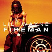
Fireman is the first single to be released by Wayne from his 5th Solo album "Tha Carter II". It was produced by Doe Boyz and at the time of release quickly had success to become his second most successful song release behind "Go DJ". The song however possesses lyrics that are not deemed appropriate so a different version had to be released for radio play. The song has received mixed reviews from critics as some people granted the song to have a great rhythm and tempo.Whereas others dismissed Wayne's lyrics and rapping style. In defence of the artist, the success of the track Worldwide speaks for itself. The song carries on with the hip-hop style that Wayne had been working with since his first album, "The Block Is Hot". His rapping style and voice is unique, although his mentality fits the stereotype of a modern day rap artist. He is happy to advertise his love for money, girls, cars and in some cases violence. This is how he has sold himself as a rapper and he has continued this throughout his whole career. The song peaked at #32 in the US Billboard Hot 100, #10 in the US Billboard Hip Hop Tracks and was his first song to reach the Billboard Pop Tracks. This allowed him to gain commercial success as his song was featuring across a wider scale of music. The video was produced by Aaron Courseault, who had previous success with other Hip-Hop rappers such as Warren G and Nate Dogg. The video uses conventions that are used in making music videos, but it focuses on using a Hip-Hop style throughout.
The correlation between the visuals and lyrics shows connections at various parts of the songs. With a number of specialised effects and fire appearing with the lyrics "Fireman" being repeated at the start of each verse. At some points of the video, text of the lyrics are superimposed onto the screen as he is about to sing them. The background of most of the sets he is in have some sort of fire in them, re-establishing the thought of him being the "Fireman". There are a number of close ups of the artist himself, this is typical of rap/hip hop songs as the artist generally portray themselves through music videos. Whether it is to show them living a high life, or bringing out a personality, it is a great way to construct their personality. Towards the end of the song it cuts to close up shots of his tear drop tattoos that are situated around both of his eyes, and throughout the video he advertises his hairstyle which has become his trademark as a artist over recent years.
Throughout the video, Lil Wayne costumes all show his wealth. He is wearing a gold chain with a cross showing his wealth in what he wears for jewellery. He doesn't have all the exotic locations that you might normally see throughout his other videos, but he definately shows at the start that he has money. With superimposed images on the screen appearing as he is saying the words, "Cash, Money". There is a sync between visuals and lyrics at this point. He uses a lighter and it cuts between images every time he presses down the button and the flame appears. This is the intro to the song, but does enough to advertise his wealth. He carries on with his rich, gangster characteristic which he had originally built throughout his career. This is proven when he often reverts back to being a "Young Money Millionaire" in more recent songs that he has released.
In conclusion, the video has small clever effects that are embedded such as the lighter/changing cuts idea. The constant fire in the background, in all different type of cuts work well as the idea is forfilled that he is the "Fireman". It also has time in the video to portray his overall character as a successful artist, with his gangster ways and his love for money, which he has lots of. The lyrics aren't too hard to understand, they are quite simple, but the song still is easy to listen to and the video is easy to understand and watch. This song promoted the rest of his album "Tha Carter II" and showed everyone what he was trying to do with his second album. It brought him success over different genres and more people were able to realise his music. It was a great success and is still one of his most successful songs despite the massive success he has had with his most recent album, "Tha Carter III".
.
Friday, 18 September 2009
Official Music Video
How is the video used to construct the image of the artist/band?
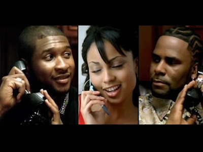
The video starts with a close up of the artists that are performing the song. They both introduce themselves to promote each other. This is shortly followed by an establishing shot showing a mansion. Showing the wealth of the two artists, they both are known for having large egos and this promotes them to be rich. It is also typical of R&B videos to show glamorous cars and buildings in the videos. The song is a narrative and the lyrics are stated at a slow tempo so you can understand the story it is trying to tell. There is a lot of relation between the on screen images and the lyrics. Showing a number of close-ups of the girl that the two artists are both describing. There is a clever shot in the video that lasts for a while, the screen cuts in half and you can see both artists in different locations talking to each other on the phone. It has close ups on the phones, which appear to be modern and worth a lot of money, this carries on with the glamorous style of the video. Both the settings appear to be modern and full of technology showing them both to be rich. This cuts out into shot showing all three of them and close ups of the girl they are describing, showing close ups of different body parts. The girl is used as a center of attention in the video and it is based on her, this is used in many videos and she is used as eye candy. It then goes onto them driving in sports cars once again promoting their wealth. It then cuts into many different exotic locations showing them each individually with the girl in the video. The lyrics show them to be clean-cut people and give them a reputation of treating people well; this could be used as they both have a well-known history of dodgy relationships. After this a number of quick shots are used showing the two artists playing basketball, showing them to be sporty and that they take care of themselves.
The sound in the background is a sample used, there are no instruments and the beat is ongoing and being spoken over. This is how rap music is typically made and works well with the song. It also shows them to have a good relationship and it helps with their on screen chemistry. The lyrics in the song are well balanced to allow all ages to watch the video and listen to the song. This also goes with their clean-cut image they are trying to portray. The mise-en-scene in the video mainly consists of exotic locations, fast cars and modern and expensive things; it shows a life that many people want to live. This is typical of most R&B artists that like to show their money and prowess. The editing in the music video is very well used to construct the characters that the artists are trying to portray. There are a number of different ways in which they have done this including a shot showing all three people on the screen at once in different locations. This puts the girl at the center of attention as she is in the middle and goes along with the narratives of the song as she is based to be coming in between the two friends.
In conclusion, the video is well constructed between the two artists, this is one of the first videos created since R Kelly was cleared from his paedophile scandal. He was proven not guilty and now he is trying to use that to reboost his career before he was given a bad name. The video advertises his upcoming tour, "Double Up" in which he will feature with other artists in a tour around North America such as Keyshia Cole, J Holiday and Ne-Yo. He also promotes himself as a rapper that loves beautiful woman and loves money. His characteristics are stereotypical of the modern R&B/Rap artist. He isn't quite as edgey as most Rap artists which allows him to appeal to a more mainstream audience. This video is very successful in showing his desire to come back into the music industry and become successful again. He appears to have put the bad publicity behind him with this video, another clever thing was to work with the other artist in the video Usher who has been extremely successful and has become increasingly popular amongst the younger generations over recent years. The video is easy to watch and tells the story well. The lyrics and video sync well and it is easy to interpret what happens almost without listening to the lyrics. The girls used in the video are all glamorous and beautiful which is what is normal of all R&B music videos. This video is very well made and I think it done well to rebound his career after the end of his bad spell.
Wednesday, 16 September 2009
Thursday, 10 September 2009
Music Video Synopsis
(Intro) Diegetic sound will be imported into the video. We are using a song that is also sung by R Kelly. This will promote the rest of his album and the upcoming songs.
Main character working out inside a gym for the first few quick shots. Extras in the background showing it is a public gym. Short sequence of him running through a rundown area. (We have chosen to use an area locally. Pictures will be uploaded shortly. He is listening to another song on his iPod whilst we are filming this sequence. As he enters his house and throws his equipment to the side, we will focus a close up shot of his iPod changing song to our actual song we are promoting, "World's Greatest". This happens simultaneously to him falling asleep and into a dream. We are going to use a blur effect that is used in other music videos and has proven to be successful. We will use a blur effect to try and create the sense of our main character falling into a dream. Whilst he is in the state of a dream we will show him being built up using a selection of different lifestyles. We will show him training, and fighting his way to the top. We will hopefully be able to show him living the dream lifestyle at the end of the video. Being the "Worlds Greatest".
We have secured the following filming areas..
Garage (To show him purchasing a new car)
Local Gym (Training/Fighting)
Recording Studio (Cutting to shots of character singing)
Names: Adam McNamara, Arjun Raja and Adam Sutherland
Blog Address: Group 1
Name of Artist and Song Title: R Kelly – The World’s Greatest
Why have you chosen to promote this band/artist?
He has been very successful over a sustained period of time during his career that has spanned out over 15 years. We all like the genre of music that he works in.
Why have you chosen to make a promo video for this song?
We all have agreed with the song, as it is one of his better songs. The video isn’t recognised as other songs in the genre, and we feel we can work with the lyrics.
What are ideas for your video?
Settings – Gym/Urban Areas
Characters – Main character only. With extras involved.
Props – Gym equipment.
Clothing – To personalise the characters. Show a transformation from his real life to his dream life.
A2 Start
We have decided to keep the same group as before, but we have lost one member of the group as he has left school. We had the chance to add others to the group but felt that we worked well together before and we are confident in completing the task between the three of us.
We are looking forward to getting into grips with the work as we are all fans of the song that we have chosen, we thoroughly enjoyed last years work and hope we can improve from our experience.
Tuesday, 12 May 2009
Risk Assessment.
This is our risk assessment sheet. We had to complete this showing all the potential risks that could have happened during our film. This could range from Arjun falling down the stairs, or the house catching fire whilst burning the toast. We had to choose whether the risk was 'Low, Medium or High' depending on the chances of this occuring.
Evaluation Q7
Monday, 11 May 2009
Evaluation Q6
GarageBand tutorial - click to view
LiveType tutorial - click to view, this shows a few videos of how to use LiveType
Evaluation Q5
Evaluation Q4
This is our questionnaire results.
From the results we were able to tell that our film would appeal to young males aged 15 - 35. This had an effect on our film being classed as a 15 as we didn't want to lose any audience. We researched further into this to try and justify the results by looking at some other films in the same genre and this is what we found.
This backs up our questionnaire results, and shows that thrillers are appealing to young males across the world.
Too see any more films on the Pearl and Dean website you can find them here
Evaluation Q3
Lionsgate Films - Click here to visit Lionsgate Films website
Sony Pictures - This links you to Sony Pictures if you'd like to browse their website.
Evaluation Q2
Evaluation Q1
Sunday, 19 April 2009
Evaluation Question 2
Our film was originally going to be featuring two males and a female. With the female being killed off, but due to some problems in the production of the film, we had to revert to using three males. I think that we gave males a balanced representation overall, showing that youthful males can be successful, but on the other hand our killer is a youthful male. Dressed in a stereotypical way. Our film shows Arjun not being able to cope with housework and trying to look after his child. He is waiting to go to work and his character is based on a typical guy that is making a living to support his family. There is a negative representation of the male character Arjun is playing as he is easily targeted by the murderer as he is not looking after his child responsably. We have tried to compensate for this with the music that we play just before which is representing a sad feeling and sorrow feeling towards Arjun. This is inserted in the film to make the audience feel sorry for Arjuns character rather than think that he deserves what he gets. We have various camera shots showing the murderer entering the house and this shows a negative representation of males. Showing his costume and the way he breaks into the house. We see that he has planned this as he uses the same window to break in the second time, it is shown negatively as he kills Adam's character for no apparent reason. To complete how negatively we are representing the killer, he speeds off in a car away from Arjun showing no remorse for what he has done.
Wednesday, 1 April 2009
Production of the Opening Sequence - Day 2
Time of filming: Daytime.
Production of the Opening Sequence - Day 1
Other props we will be using on the first day of filming include.
Cutlery
Kitchenware - (Toaster, Fridge etc.)
Food (Bread, Butter etc.)
Clothes (Tie) - Arjun will appear to look rushed, scruffy and not well prepared.
A Small Blanket
Time of Filming: Daytime
Monday, 9 March 2009
Thursday, 5 March 2009
Preliminary sequence
Wednesday, 4 March 2009
Results of Questionnaire
The graph that we have conducted has shown us that our film will appeal more to men, mostly aged between 15 and 34. The results show that most men aged 15 - 34 prefer the Horror genre compared to other ages. From this we are going to be looking at advertising our production towards males in this age gap.
Thursday, 26 February 2009
This is our questionnaire that we have put together to try and find out what the audiences are more interested in. We have come up with a list of questions that we will feel give us a good idea of what age group and gender will prefer our film. We are going to give this questionnaire out to random members of the public to make our results more likely to be fair.
Questionnaire
Monday, 23 February 2009
Terminator 2
Preliminary Sequences
Wednesday, 18 February 2009
Analysis of The Strangers
Analysis of Opening Sequence
The Strangers - (2008, Directed by Bryan Bertino)
Featuring - (Liv Tyler, Scott Speedman)
As the film starts, a black background emerges on the screen as a number of film companies, and other such credits are superimposed onto the screen, whilst this is being presented to the audience, a non-diegetic sound is played in the background. The sound is of a slow tempo, and brings suspence and drama. This is typical of horror films, and many films use this to create a feeling in the audience of suspence. It is also used to lead up to moments, and then relieve the tension by having a totally normal following scene. This is used to tease audiences in horror films. Shortly after the sound ends, a mans voice is heard, as he is reading out the font that is shown to the viewer. This is informing the audience of the storyline of the film being taken from a real life occurance. This will only bring more suspence and reality to the film. After this we are taken to a point of view shot, tracking out of a car window. This is showing the car going past a number of houses, before eventually the screen is darkened out. Following the darkened screen is a non diegetic sound of a phone call happening between a lady and a police officer. The lady appears to be very scared, confused and upset by what she has found. Whilst we here the conversation that is happening between them, and number of shots are taken, of a house. With the door open, and a number of objects inside. The camera shows a number of close ups, one most notably on a knife covered in blood, and another with blood smeered across a brightly coloured wall. This works in correspondence with the sound of the phone call, as the lady is describing the place being shown to the viewers whilst she is in a state of panic on the phone. After this, the screen appears to go black again, and in the same font as the other superimposed text that was on the screen previously, The Strangers (title of the film) comes onto the screen.
The viewers are not introduced to any main characters by image, but they are introduced to a lady by her voice on the phone. This asks questions to the viewer that they may want to find out. What the lady looks like? Where is she? Why and How did she get there? This is quite common in horror films, with giving small answers but asking more questions at the same time. The only other person we know about is the lady on the other end of the phone.
As the characters in the film have not been totally shown to the audience. It is hard to say how they are constructed by image. But the phone call that occurs shows the deep insecurity of the lady on the phone, and where she is. She sounds scared and upset. This makes the viewer want to get to know what has happened for her to be in this state. But it also shows that she is most probably under threat from something or someone close by. This could possibly lead to a dramatic scene.
The opening sequence doesnt reveal too much about the setting, but almost reveals enough for the viewer to understand that the setting is quite private and kept away from other houses. The house seems quite a big house for whoever lives there. But with the blood and other objects that are covered in blood lying around. The house is shown to have had something bad happen inside it.
The only real editing used in the opening sequence was the superimposed text that was inserted into the film. This is done well and is used efficiently to introduce the film name, and a number of actors and directors involved in making the film. This is also used in telling the audience the backstory of the film. So they can easily understand the circumstances of the characters, therefore understanding the characters and the reason they are who they are.
The sound used in the starting sequence of the film is typical of a horror film, with very tense and nervous music that leads up to the credits being shown at the start of the film. Also in the film start a narrators voice is used to talk about the situation the people find themselves in. The voice used is quite a stern and could come across as a scary voice. This is used to build up tension in the audience.
The opening credits in the film are presented quite quickly, but are simple enough to understand as the film is promoting it's directors and main actors. This is all presented in the same font and on a black background, which is a simple but professional way to do so. The transitions in the opening credits doesn't speed up, or slow down. It maintains a steady pace.
The films start overall, is pretty balanced and typically what a horror film's opening sequence should be like. Not to many clues are given, a lot of questions are asked , and tense sounds and other small techniques to make the audience nervous are used. This is a solid opening sequence to a horror film.
This is the first 10 minutes from "The Strangers," it shows the opening sequence for you all to take a look at.